Outcome-driven product design: Proven systems for results
Outcome-driven product design: Proven systems for results


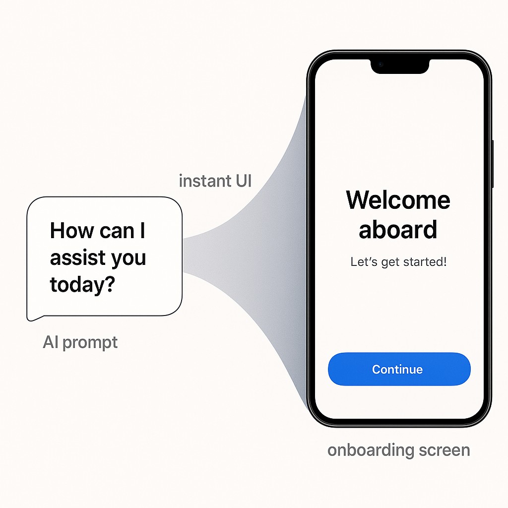
When AI Handles UI: The End of Pixel Scarcity
A few months back, I shipped a set of onboarding screens that, frankly, looked pretty good. Here’s the kicker. I hadn’t roped in a designer or even fussed over Figma. I watched an AI tool bang out the UI code as I leaned into outcome-driven product design, describing what I wanted: rough functionality, a little branding, the colors from my logo. Within an hour, I was running the app. Seeing those production screens land, knowing how little “design labor” I’d spent, was a genuine shock. Pixel-perfect used to be a logjam. Now, apparently, it’s just a prompt away.
I’ll level with you. I’ve never been much of a front-end person. For most of my career, that’s been the part I hand off or fudge my way through. If you dropped me in a room full of designers, I’d be the one mumbling about CSS hacks and hoping nobody asked me about font pairings. So when I say the UI turned out fine, I mean it—fine in a way that would have saved me hours of wrestling with spacing and worrying what “consistent visual rhythm” is supposed to mean.
What’s really wild is how the workflow feels now. These days, I just let AI write my UI code. That’s not hype. It’s an everyday shift. You feel that tempo change fast. Developers complete tasks quicker, especially the repetitive bits, when tools like Copilot handle the basics for you—see GitHub Copilot productivity.
And once the base exists, it’s practically trivial to spot issues. Even as a non-designer, it’s easy to tell when a screen looks off. With a few prompts and 15 minutes, I can iterate it into something much better. The loop between “this feels clunky” and “this looks professional enough” keeps shrinking.
But that leaves a tough question hanging. If I can “vibe design” my way into a decent UI, where does that leave professional designers? When decent is on tap, does design become just a style layer, or is something deeper still missing? That tension’s not going away.
Beyond Looks: Why Design Still Matters
Let’s just lay it out. Baseline UI is commoditized now. You can get “good enough” off the shelf—or, more to the point, by feeding rough specs to AI and watching it fill in the blanks as engineering teams start adapting for scaled AI. I probably spent too many cycles thinking about screens, pixel tweaks, and surface polish. But that misses the forest for the trees. AI lowers the cost of “good enough” UI. Design’s value has always been more than that.
If you’re reading this and thinking, “Is diving into design systems and metrics actually worth my time?”—I hear you. Six months ago I wondered myself if this blurs the line with product management, or whether staring at dashboards sucks the creativity out of the job.
So here’s the move. Good UI is cheap. Good Design isn’t.
This shift matters because, in practice, the real value isn’t the arrangement of buttons. It’s a design for outcomes mindset—work that drives retention, satisfaction, and conversion. Those are outcomes AI alone can’t capture without human context and intent. The real edge comes from leaning into adaptability, shared accountability, and context-aware systems that let human smarts shape the results—see adaptability and accountability in AI design. If you want your work to stay defensible as things keep changing, start measuring success by the business outcomes your system delivers. Not just how quickly you hit “good enough” UI.
Translating Design Ownership Into Real Capability
Defining scalable design systems always sounded theoretical to me—naming tokens, cataloging patterns, organizing those accessibility rules. It felt like I was making up new vocabulary for things I’d just hardcoded before. But once I actually built out a set of core tokens (colors, spacing, typography) and locked down some patterns (card layouts, repeatable button styles), I realized two things. The team shipped way faster, and every screen looked instantly coherent.
The magic isn’t in “perfect” choices—it’s in durable repeatability and making smart build vs buy decisions. Suddenly, instead of arguing over alignment or colors each release, we reused the same rules, baked them into our UI components, and watched the whole product feel intentional. Accessibility checks got easier too. You end up spending your energy on real problems instead of pointless rework, because those abstract names become shortcuts everyone can use.
The next step is an outcome-based UX strategy: instrument key flows with metrics. I started tracking where users abandoned onboarding, where conversions dropped, and how satisfied folks were after completing actions. Gone were the days of wondering. Now I could literally see the drop-offs in onboarding and pinpoint which screens confused people. Quantitative feedback made all the “should we tweak this?” debates land faster—if satisfaction goes up and drop-off goes down, the changes stuck.
Translating research into prioritized fixes is another game changer. Early on, I spent way too much time polishing the appearance of features nobody complained about. Combining support tickets with behavior analytics and real user interviews made it totally clear what to fix first. Here’s the deal. Just because I think a screen looks nice doesn’t mean it moves the needle. Prioritization beats polishing. Users—without knowing anything about design systems—point to what’s actually broken or frustrating. Focusing on those real issues brought actual results, not just prettier screenshots.
Aligning brand across everything—your product, site, customer emails, feedback interactions—matters more than I realized. When the visual language and interaction patterns sync up, users feel like they’re in a single, unified experience, and storytelling that drives product alignment keeps system-level ideas consistent across teams. Instead of stitched-together tools and half-baked landing pages, the whole journey lifts in perceived quality. I used to eyeball this stuff, but tying the brand into UI tokens and templates made every touchpoint make sense together.
Let’s walk through a real scenario. Revamping onboarding. I started by laying out the flow with clear, repeatable patterns—consistent buttons, form fields that followed accessibility rules, and no weird visual mismatches. Plugged in simple metrics to watch drop-offs and completion rates. Then, made quick tweaks based on where users got stuck (usually confusing form labels or missing “next step” cues). Each small improvement was just a code push or an updated token. After a few cycles, design for retention paid off—retention through onboarding shot up. I saw the metrics move in real time. That turned design from a guessing game into a real lever for business impact. Instead of hoping the new screens felt better, I watched the numbers climb and iterated with purpose.
Here’s the unresolved bit. I still catch myself obsessing over little UI details no user actually cares about. The system keeps me focused, but old habits die hard.
This is the shift. The designer’s role isn’t to just nudge pixels anymore. It’s to own the outcomes. We’ve moved on from vibe-driven tweaks to building systems that drive results. That’s a mandate worth chasing.
Addressing Doubts: Making Outcome-Driven Design Work
Let’s get real about the time investment. It’s tempting to skip the setup. Just jump right into building features. But every time I’ve done that, I’ve paid for it in cleanup later. The truth is, adding small bits of instrumentation and laying down a simple design system early on saves you hours down the road. Two extra steps now, less headache every release.
Worried this is just product management dressed up as design? I grappled with that myself. Here’s where the line actually lands. Product management sets the goals, but outcome-driven design shapes how those goals feel to the user. When you work together and keep the focus on user outcomes, you avoid the usual turf wars—no more arguing over who owns the button style or the user journey.
Now, about the metrics—don’t worry, they aren’t creativity killers. If anything, they act like prompts and guardrails that actually help you take smarter risks, and support debugging subtle AI agent failures when language-level quirks skew behavior. Constraints push you to invent inside the boundaries, not just repeat old patterns. Creativity thrives when you know what success looks like, because you can bend the rules for a reason rather than just for the sake of change. And the best part? You’re free to try bold moves and see, in real numbers, whether they land.
That’s the payoff. Outcome-driven product design doesn’t erase creative work; it puts it where it matters most. The small, steady steps you take grow into leverage, and your judgment shapes the real experience, not just the surface.
From Playbook to Practice: Steps Toward Outcome-Driven Product Design
Here’s the cadence I keep coming back to. Start by defining your tokens and patterns—the basics like colors, type, spacing, and core components. Don’t overthink the taxonomy. Just agree on names and bake them into your UI. Next, instrument the flows that matter (onboarding, checkout, whatever actually moves the needle)—see designing outcome-focused onboarding flows. Drop simple metrics so you see where users hesitate or drop out.
Then, use research—user feedback, analytics, bug reports—to translate noise into actual priorities. Fix what’s broken, not just what’s ugly. Finally, make sure your brand is aligned across everything customers touch: web app, emails, docs, even error states. This all sounds like a lot, but the first pass won’t be perfect. That’s normal. When your system is set up right, refining is as easy as flipping a token or nudging a rule. The point isn’t initial perfection. It’s setting up for easy iteration.
Why now? Because this approach helps prove design ROI by building a direct line between design and actual business results—things everyone cares about. Retention, satisfaction, conversion. When you can show, “we fixed this flow—watch what happened to onboarding,” suddenly stakeholders stop seeing design as just a surface detail. There’s a real confidence in pointing to a metric and a change and knowing you moved the needle.
Need clean, on-brand copy for docs, release notes, or onboarding emails without the busywork? Generate AI-powered content in minutes, control tone and structure, and ship clear, consistent messaging across your product.
AI made “good enough UI” a commodity, but it put a premium on owning outcomes. That’s where the future-proof value is. Start small, ship quick improvements, and you’ll see—design isn’t just defensible. It’s finally interesting.
Enjoyed this post? For more insights on engineering leadership, mindful productivity, and navigating the modern workday, follow me on LinkedIn to stay inspired and join the conversation.