Design AI Progress Indicators: Build Trust with Visible Progress, Not Reasoning
Design AI Progress Indicators: Build Trust with Visible Progress, Not Reasoning


Visible Steps, Visible Trust
It hit me the first week I got access to the new GPT-5 build. Seeing how the choice to design AI progress indicators—actual steps appearing as it worked—made it feel almost instantly smarter and more careful. Instead of the usual flash of output, it paused, outlined its approach, showed me which sources it was weighing, and then carried on to the draft. Sometimes it took a little longer, which I used to resent, but now I was watching it move through the process. Funny how quickly my attitude changed—from impatience to something a lot closer to trust.
I caught myself thinking, “Maybe it really is making careful decisions.” What I realized was that I didn’t actually know if the steps shown were ‘real.’ Having them visible made it easier for me to believe the system understood the problem and wasn’t taking risky shortcuts.
Here’s the big issue. Most teams still ship automations that hide everything behind the scenes. Silent, black-box models that promise magic but show nothing—leaving users waiting, guessing, and ultimately hesitating to rely on them. If you’re in this kind of situation, you’re not imagining the friction.
The solution isn’t to explain every decision. As an AI builder, I’ve been struck by the labor illusion—people trust systems more when they see work unfolding, even if automated. The lever here is observability. Surface progress signals like drafts, intermediate stages, or sources, and separate those from deep reasoning or decision explanations.
Stick around. I’ll show you design patterns, common risks, and practical steps for adding observable progress—without pretending your system has human logic behind each move.
The Labor Illusion and the Real Impact of Progress Signals
Let’s start with the labor illusion UX itself. It’s weirdly simple. When people see visible signs of effort—steps, stages, even waiting bars—they feel more confident in what’s happening. We latch onto observable process cues, not because they prove quality, but because they signal someone (or something) is taking care along the way. You see five steps ticked off, and it’s easier, subconsciously, to trust what comes out at the end. Progress doesn’t always mean transparency, but it completely changes what users expect and how much they’re willing to rely on the system.
Take Domino’s pizza tracker. Before it, ordering pizza was pressing a button and then staring at the door, hoping you’d hear a knock soon. The tracker broke things down. “Order received,” “in the oven,” “out for delivery.” Suddenly you could see the invisible work. That small change—showing what stage your pizza was at—didn’t speed up the cooking, but it turned the whole experience from anxious silence to reassuring, predictable waiting. That tracker became part of Domino’s turnaround story because it made every step visible.
This is where it’s easy to get tripped up. Progress signals aren’t explanations—they’re about AI transparency vs observability. You can show drafts, source lists, or a status bar, but that’s not the same as opening up the decision-making logic or offering real traceability. Progress isn’t decision transparency. Think of progress as showing the stops along a route, not handing over the map with reasoning for every turn.
You might wonder, aren’t we just being fooled by the illusion of labor? Good catch—visible effort can definitely mislead if you present it as proof of deep reasoning or quality. The fix is to label progress signals explicitly and never let them blur into explanations. Six months ago, I was still confusing the two, letting status updates slide into explanations, and users started asking harder questions about “why” that I couldn’t answer. Here’s what’s changed since I started handling this separation with discipline: when transparency is increased, users make more accurate automation decisions, move faster, and feel less burdened—while trust and usability climb too. In other words, we can give users confidence without pretending our systems are more “intelligent” than they really are. Being up front is what earns trust, not the illusion.
Design AI Progress Indicators That Feel Trustworthy
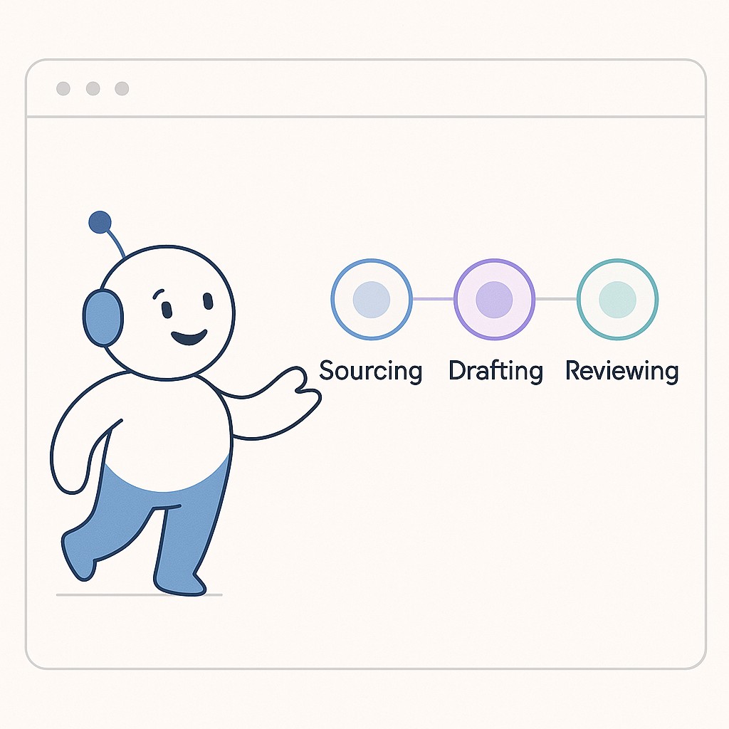
Think about how you design AI progress indicators the system can actually show as it works through a task. The obvious ones involve showing stages—like “data received,” “analyzing,” “drafting,” “reviewing”—but that’s just a start. I’d also consider drafts (even partial ones), intermediate outputs (like extracted entities or key points), quick sample checks (“Validating sources…”), and spot references (actual links or document names consulted). The trick is to present these as simple status cues, not as explanations or post-hoc justifications.
The goal is to reduce that user uncertainty about “Has anything actually happened yet?” When you surface a concrete signal—no matter how small—it reminds the user the process is moving. It’s a bit like a typing indicator in chat apps. Progress indicators communicate the system is working and reduce uncertainty—which keeps users from repeating the same action out of confusion. Instead of staring at a blank screen, they see momentum and hold back on mashing the refresh or submit button. Simple, visible feedback like this also makes troubleshooting simpler—if something gets stuck, the user (and you) know where.
When you frame these, drop the illusion that these are explanations. Call them progress signals. If you want to annotate, use confidence ranges (“Estimated summary completeness: 60%”) or direct ties to what’s in process (“Reviewing 3 source docs”). And above all, avoid causal language. Remember—AI doesn’t think. Don’t imply logic where there’s only pattern-matching or aggregation.
Map this to a real workflow. I’ll use a content pipeline because most of us have one running silently. Start with explicit acknowledgement that ingestion has begun (like “Items received: 102”). As the pipeline structures data, show a “schemas assigned” or “structuring complete” marker. When drafts are created, let users see them before finalization, paired with “review flags” (e.g., “4 items auto-flagged for ambiguity”). Each of these is an intermediate artifact that can boost the perceived care and thoroughness of your system. I’ll admit, I hesitated at first—exposing these steps felt risky, like maybe users would think the system was less polished. Turns out, just the opposite happens. Seeing progress makes users believe the system is working harder and with more attention to detail.
I once spent half a day watching a kettlebell video where the trainer broke down every step—foot angles, grip, even breathing out. It was a little much, honestly, but after that, I found myself trusting his form way more than others. Seeing all the fiddly steps laid out, even if some were overkill, made it feel like nothing was skipped. Same thing with UI: letting users watch the assembly builds confidence, even if your “assembly” isn’t that glamorous.
Practical Patterns for Making Progress Visible (and Useful)
You don’t need to overhaul your whole stack to make progress signals part of your workflow. Start simple. Emit events whenever your process hits a meaningful stage boundary—raw data received, inference started, draft ready, quality checked. Stream intermediate outputs (even just key stats), and keep a log of sources or safety checks along the way. These become live updates for your UI via something as basic as an event bus. The trick is to feed the interface with signals, but align with AI loading states design: keep your loading indicators, skeletons, and spinners as gentle reminders, not the main event. If you ever find yourself layering spinners on top of spinners, it’s a sign you’re hiding too much real progress under the hood.
For the user interface, you’ve got options for AI UX progress signals—timeline chips that light up as stages complete, checklist-style steps, collapsible panels for drafts or notes, tiny source badges that hint at what’s being used, and a real-time activity feed rolling through every event. The best thing I did was corral these into a clear “Progress” section, which frames all these signals as evidence of action rather than clutter that competes with the main result.
Worried about flooding your users with noise or dragging things out? I get it. Use progressive disclosure to hide messier details unless asked, throttle how fast updates come in, and batch tiny events into a single entry. Show time estimates when possible. If things do slow down, your progress layer should still feel genuinely helpful, not just a fancier hourglass. The reality is, some lag is better than invisible dead air.
Let’s be honest. What about when things go wrong? Don’t sweep failures under the rug. Display errors, retries, even fallback attempts, clearly marked as progress events. And make your “decision made” and “error handled” signals visually distinct—so users don’t confuse a recovery for thoughtful deliberation. It’s not about confessing flaws, but about showing care in the process.
Preventing Mistrust: Clear Signals Without Headaches
Visible progress signals walk a thin line. If you just toss up intermediate steps or checklists without context, users might start thinking you’re promising deeper logic or insight than you really are. The key is to call progress what it is—movement, not meaning. Label every signal so it’s obvious. “Status update,” “step complete,” “draft ready.” Never hint that these imply causality. Keep your decision logs separated from your main progress feed, and stick a quick disclaimer nearby making it clear that steps reflect process, not reasoning. I’ll admit, I worried this would feel underwhelming, like we were deflating the magic. But clarity wins in the long run. That Domino’s tracker I mentioned earlier—turns out it didn’t actually sync to the oven, at least not in the early days. People trusted it anyway. They just needed to see movement.
Here’s the only way I found to keep myself honest. Measure how users rate competence versus how the system actually performs. If trust is rising while outcomes hold steady, you’re in the zone.
On compliance and provenance, visibility doesn’t mean exposing your core logic or opening a legal can of worms. Instead, log the sources and checks behind each visible step, attach basic provenance notes, and obey retention policies strictly. Make each progress signal auditable, but keep the sensitive stuff under wraps. Remember, over 70% of licenses on popular datasets remain unspecified, muddying legal responsibility and making provenance notoriously tricky to audit. Don’t give more away than you’re comfortable tracing.
You don’t need to guess whether your progress updates are actually helping users trust (or just making the UI busier). A/B test different levels of visibility, ask users directly about their confidence during onboarding or via lightweight follow-ups, and track where handoff friction or surprise incidents spike. Tuning is ongoing—when you see trust stabilizing and error rates dropping, you’re getting warmer.
Zoom back for a second. Progress is reassurance, not proof. Every signal is a reminder that the system is paying attention, not that it’s suddenly become wise. You’re not faking intelligence—you’re doubling down on care and visibility. That’s what keeps trust real. But I’ll be honest: I haven’t figured out exactly how much visibility is too much. Sometimes more signals crowd the experience, other times they build exactly the right level of confidence. It’s a balancing act I’m still working on.
Playbooks for Surfacing Progress in AI Workflows
If you’re running a content pipeline, treat every step as a moment to build trust with AI UX trust signals. Start by instrumenting the basics. Acknowledge when content is ingested (“Received 75 items at 9am”), mark when it’s structured (even something simple like “Schema applied: blog, guide, podcast”), and make drafting visible—not just the final version but the messy in-betweens. Let reviewers see open drafts and call out review flags; it’s less about explaining each flag and more about showing that checks happen.
Surface sources and sample checks—think “Sources referenced: X, Y, Z; sample plagiarism checked”—so the pipeline emits signals as work proceeds. Then, report on every draft and flagged item, and capture daily insights for quick iteration. If you timestamp or log these, you give both users and editors a running sense of how content gets shaped, step by step.
For developer tools, bake visibility right into the workflow. When a build runs, surface linting, test generation, dependency resolution, and actual build steps as progress chips—colored badges or timeline entries. Keep suggestions (like “add error handling”) distinct from automated decisions (“dependency fixed”). Just label them and move on; that’s enough to separate hints from actions.
And for data pipelines, stay grounded in the real flow. Extraction, transformation, validation, then load. Each step should throw off a breadcrumb—sample outputs for extraction (“Extracted entities: 312, e.g., John Smith, ACME Corp”), transformation hints (“Normalized 80% of dates”), validation events (“3 records flagged for anomaly”), and finally load confirmation (“Loaded to warehouse at 2:14pm”). Present these as status events—“extraction finished,” “validation passed”—without dressing them up as causal explanations. The moment you shift from hidden progress to visible signals, users stop wondering what’s taking so long or whether anything’s actually happening.
Create AI-powered content fast—turn ideas into editable drafts, publish-ready pieces, and reusable snippets—so you can test observability patterns in practice and move from waiting to confident iteration.
If you want to see trust move, don’t try to explain everything—just expose one intermediate step and label it as progress. Watch what changes. Show, don’t justify.
Enjoyed this post? For more insights on engineering leadership, mindful productivity, and navigating the modern workday, follow me on LinkedIn to stay inspired and join the conversation.