How to Persuade With Data: Build Trust, Normalize Ranges, and Move Decisions
How to Persuade With Data: Build Trust, Normalize Ranges, and Move Decisions


When “Equal” Weights Still Skew the Results
I’ve always believed the numbers should speak for themselves. If you build a good model, make it fair, run the math, show the output—it should be enough. And especially when the stakes are high and folks around the table know their way around a spreadsheet, it’s easy to mistake process for proof and miss how to persuade with data, to assume the system is bulletproof and that transparency is the same as persuasion.
So when we put together our latest decision model, we leaned on equal weights. It just made sense: treat each criterion the same, no hidden agendas. There was this confidence—a little smug, if I’m honest—that equality in the math would translate into real-world fairness.
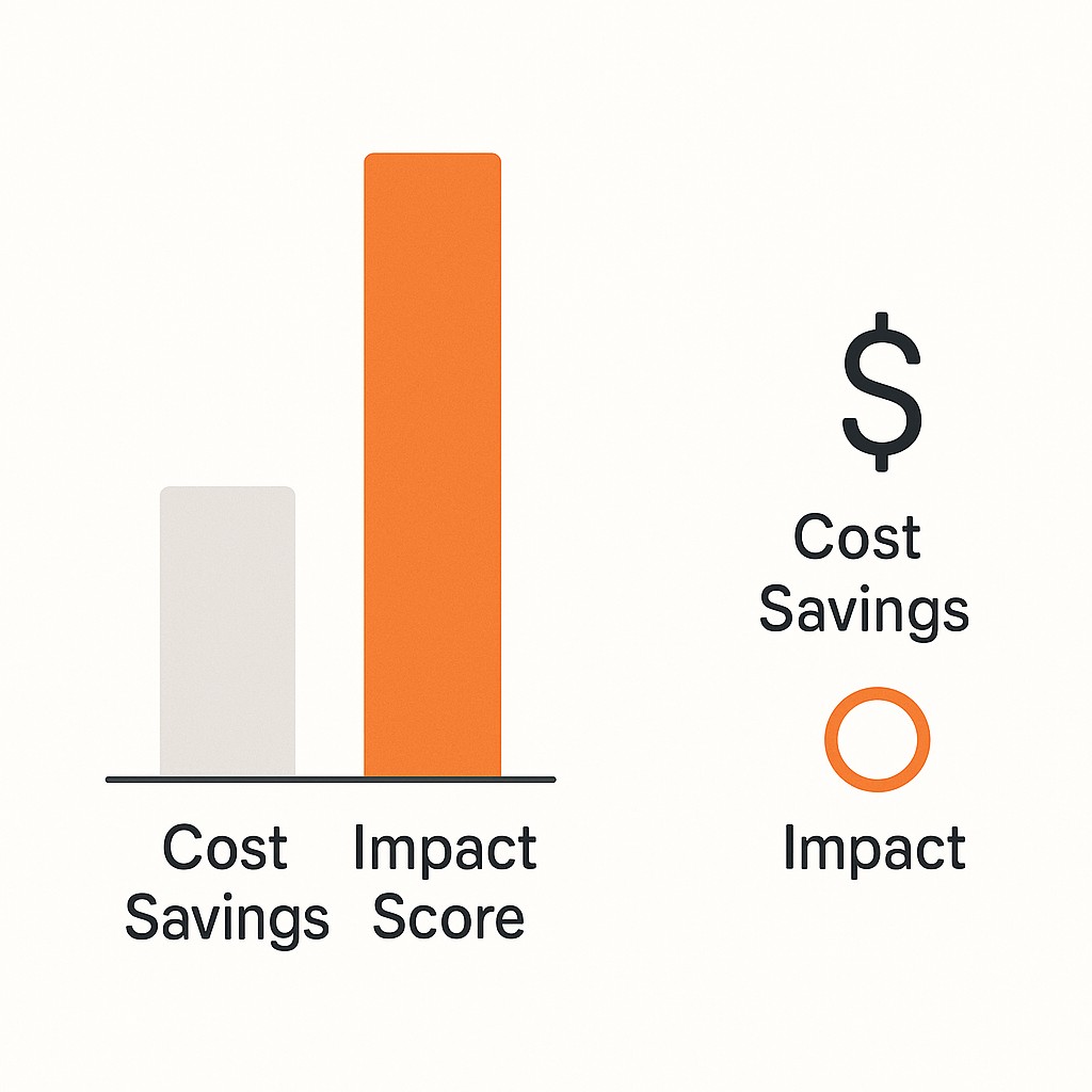
But here’s the catch. One criterion had a much wider numeric range than the others. Let’s say we had factors like “cost savings” (running from 0 to 10) and “impact score” (running from 0 to 100). Even with equal weights, changes in impact score ended up driving almost all of the movement in the final ranking, while cost savings barely moved the needle. It looked fair—columns balanced, tidy formulas—but the bigger range quietly dominated. The math didn’t lie, but it didn’t tell the whole truth, either. If you’ve ever looked at a weighted model and thought “this doesn’t feel right” even when the summary checks out, you’ve seen this in action.
Some people saw the data and nodded along, taking what suited them. Others pushed back, saying it didn’t match what they knew from experience. I kept thinking, this is obvious. Why isn’t it landing?
Data isn’t just about being right; it’s about being understood. If we want decisions, adoption, real buy-in, we have to frame, translate, and earn trust. Otherwise, even the best math ends up ignored.
The Gap Between Correctness and How to Persuade With Data
Data is one of the most powerful and most misunderstood tools we have. You can have precise calculations and clean spreadsheets, but if the people reading them don’t see what you see, the story gets lost. Too often, we assume a tidy chart or summary speaks for itself, when really, it hides layers that weren’t meant to be hidden.
An equal-weighted model with uneven ranges is a perfect example. Picture two criteria side by side: maybe “team satisfaction” is scored from 1 to 5, but “budget impact” is scored from 0 to 100. Even if you give them the same weight, that wide range lets “budget impact” take over. Engineers, practicing data storytelling for engineers, see this and immediately think about normalization—scaling numbers so they compare apples to apples. For most stakeholders, though, that technical step is invisible. They see equal weights and assume equal influence, not realizing the math quietly tips the scales.
None of this matters if the audience doesn’t trust where the numbers come from, how they’ll be used, or why this particular approach was chosen. Models run on formulas. Persuasion runs on trust—build trust with data—on shared language and intent. And those come from people, not spreadsheets.
So here’s the shift. Accuracy alone doesn’t move decisions. Good data demands more than accuracy. It demands clarity, persuasion, and trust.
A while ago I found myself arguing for my “faultless” model late into the evening—pizza boxes on the table, half the room distracted or already checked out. Turns out, no amount of perfect sums could keep anyone interested past 8 pm. What stuck was the one person who piped up from across the table and said, “Wait, if that one score is ten times the size of the others, why are we bothering with the rest at all?” That hit harder than any chart I showed. Strange how a moment of flat exhaustion can land a clearer point than a hundred careful words.
Turning Analysis Into Actionable Evidence
First, let’s put aside the idea that persuasion is only about getting the math right. It’s part math, part data storytelling, part empathy. I’ve learned technical readers are more effective when they aim for clarity over just precision. We earn more trust not by being more detailed, but by making what matters impossible to miss.
Getting specific—remember that wide-range criterion from before, “impact score” running 0–100 while “cost savings” stays at 0–10? It’ll almost always dominate in an equal-weighted model. Even though the weights say “everyone gets a vote,” the biggest number runs the room. A straightforward fix is normalization or scaling. Now, “100” is as powerful as “10,” and every criterion can actually flex. I know it’s tempting to keep this tucked in a technical appendix, assuming only data folks need the details. But I try to make these steps plain—showing my work and breaking it down for any audience. Transparency isn’t about more complexity; it’s about making the logic simple enough that nobody has to guess.
The dominant range is like tossing a chili pepper into a recipe. No matter how much you measured the other spices, that heat will crowd out everything else. Equal weighting on paper is great, but the flavor is off if one ingredient bullies the dish.
That’s why I lead with real stakes now. Instead of starting with formulas, I say: “Here’s the outcome—this project would have outranked the others by a mile, but only because one factor had an outsized say.” When people see what changes in their world, the math that follows just clicks into place. Making the math accessible pays off. The correct reasoning rate jumped to 42% with plain text, and 60% with simple frequency trees. When I made this the front door, even the most skeptical stakeholders stayed in the room longer.
Analogies and visuals work wonders, too. I’ll say, “Think of the wide-range score as a bigger volume knob—it just drowns out the rest no matter what.” Then I sketch it—just axes and boxes, nothing fancy. You’d be amazed how much faster a simple line chart or quick comparison locks in understanding. And always, invite someone leaning in (and ready to challenge in good faith) to poke holes in your story. In fact, visuals consistently outperform text when people need to recall or grasp trends.
When we treat evidence like something to be shared, not just displayed, we cross the gap from being correct to being convincing. That’s where good decisions start.
From Analysis to Alignment: A Four-Move Playbook
Start with trust, not tactics. Before you even run the numbers, show folks where you’re coming from. State every assumption, document the data, walk through the methods. If something might raise eyebrows—say, why you picked that scoring range—explain it up front. Don’t just list sources. Pull the curtain back on your thinking so anyone can follow along. I get that it feels like overkill, especially when you just want to ship the model and move on, but nothing builds buy-in faster than letting people see you’ve got nothing to hide.
Next, get clear on who you’re talking to. Don’t waste cycles trying to convert every skeptic in the building. Map your landscape: who’s genuinely curious, who’s ready to go deeper, and who’s dug in no matter what you say? Focus your best explanations and patience on the ones who actually want to wrestle with the data. You’ll move farther, faster. Decision-making gets easier when time isn’t poured into unwinnable standoffs.
Let the artifacts do the talking, but communicate data clearly by keeping them simple. Give the team something they can actually use—a crisp one-pager, maybe an annotated chart, or a basic calculator where stakeholders can adjust the dials themselves and see how the model reacts. These hands-on tools let people feel out the implications instead of just reading them. If someone wants to geek out, have a technical appendix at the ready. But you’re aiming for clarity, not just completeness.
And always close the loop with empathy. Share your draft findings with a few trusted allies first, the ones not afraid to say, “This makes no sense to me.” Listen hard to where they get stuck; that’s where others will too. Every time I’ve done this, I’ve found at least one fix that turned early confusion into downstream confidence. The goal isn’t to win debates—it’s to keep the conversation moving forward, together.
If this feels like a lot—extra explanation, careful audience selection, building simpler tools—I get it. I’d rather just let the numbers fly, too. But the patterns are clear: when we slow down for trust, clarity, and good-faith dialogue, what we build actually gets used. That’s persuasion-first data, and it’s the only kind that sticks.
Leverage, Not Exhaustion: Making Good Data Actually Stick
Stop burning effort on the immovable. Anyone can spend all day chasing folks who won’t budge, but it’s not a good use of mindshare. If you focus your energy on the ones willing to engage—those who show even a flicker of curiosity—you’ll see decisions start to stick and tension drop. Let the rest simmer. Persuasion isn’t a contest. It’s a lever to persuade with data and drive real change.
There’s always pushback about 'spending extra time' or “dumbing things down.” Here’s the fix: lean into a 60/40 split. Put 60% of your effort into framing and earning trust, then 40% on the technical details. Lead with simple, plain-language explanations up front, and tuck the rigorous proofs in the appendix for anyone who actually wants to dig. I know the gut-level worry: maybe you’ll lose rigor, water things down, look shallow. The trick is full transparency. Make your logic and tradeoffs visible so rigor isn’t hidden, just accessible.
If I were presenting that local decision model today, I’d start by showing what’s at stake for the team, walk through how that wide range drove the outcome, and offer up a normalized side-by-side for reference. Then I’d invite anyone willing to challenge the story—provided it’s a genuine critique, not a rhetorical joust. You keep the discussion focused, keep the trust moving.
Here’s the heart of it. Correctness is necessary, but alone it just sits on the shelf. It’s communication—anchored in trust and simple framing—that turns insight into adoption. I wish I could say I always get that balance right. The habit of over-explaining or, honestly, ducking the trickier conversations about method, still creeps in from time to time.
If you want to turn your models, findings, and plain-language explanations into polished posts fast, use our AI content tool to draft clear, trustworthy narratives you can share with your team.
On your next analysis: practice how to persuade with data and watch your evidence actually move the room. Good data informs. Great communication makes it land.
Enjoyed this post? For more insights on engineering leadership, mindful productivity, and navigating the modern workday, follow me on LinkedIn to stay inspired and join the conversation.